15 years ago a movie about
Széchényi István -an important figure in Hungarian history- was released. It was titled "Hídember" which literally translates to "Bridge-man". With my brother we immediately made some marvel-like comic sketches about Széchényi as a super hero fighting against his nemesis
Franz Josef, the emperor of the former Austro-Hungarian Empire.
Random made-up scenes from this imaginary comics of ours was an ever lasting running joke between us. Neither of us has ever seen the movie.
When I told him about that I am learning to draw the Marvel Way, he asked me to make a nice cover for the "Hídember" 1st issue for his birthday. I really liked the idea, so I took the challange and after many weeks of work today finally I finished it! Here it is:
 |
Translation:
Title: The Patriotic Bridge-man
Emperor: Stand back Robo-soldiers! I the EMPEROR shall take care of the BRIDGE-MAN, so he won't be in the way of the Empire anymore!
On the left: Nr.1 - New, In color!
Under it: Meet the Mysterious DR ZWACK!
|
Even though it took waaaay too much time, I am pretty satisfied with this. Best birthday gift ever!
In the upcoming posts I am going to show how I came up with the character designs, how did I make up the composition, the texting, the pencilling, inking, the coloring, and about some last minute after-effects.
Character design
Before I could start with anything, I needed two design the characters first. I already had an idea what should be happening on the cover of the first Hidember issue: The hero is facing overwhelming force of the enemy - The Kaiser with a gigantic mecha, accompanied by his robotic soldiers (see final cover picture in first post). So it was already obvious which actors were needed for this scene. The texting and the exact setup was not clear yet.
An important thing that has to be kept in mind is that the story takes place in an alternative steampunk 1850's, shortly after the lost Hungarian revolution against the Austrian oppression.
Lots of things are the same, but steam powered (or whirled up) technologies are much more advanced and used.
First I started with designing how the robotic soldiers -named robolabanc- should look like. ("labanc" is a word that Hungarians called the austrian soldiers at that time). The idea about them that they are the whirl up mechanical mindless soldiers of the Kaiser. Here are the designs:
 |
Robolabanc pencil design on the bottom. On top you can see Franz Josef. I didn't need that much investigating to draw him.
|
 |
Inked and coloured Robolabanc. I just made it for fun. It wasn't really necessary.
|
For them to be created, I needed to have reference what clothes and weapons did a soldier have.
This was the clearest drawing I found of their most common uniforms:
This is almost everything I needed, but its face had to be very puppet like. After trying to create faces myself, I realised that the internet can help me out again. I searched for "austrian puppets 1850", and found this perfect example:
The next thing that needed to be designed, was the highlight of the picture - the gigantic mech of The Kaiser. First I came up with a very primitive prototype:
 |
| This was a very quick sketch. The basic idea is that it has to be big (but not too big), steam powered with pneumatics, and has to have one arm with 4 built-in field guns. |
After I sketched the basic idea, I spent some time to create a more detailed version. For that I needed some references again. I had the idea that the whole framework should be having similar structure (and embellishments) like one of the bridge in Budapest (capital of Hungary) named after Franz Josef. Below, you can see the final design, and the references under it:
 |
| The Kaiser's Mech. While creating it, I figured that the right hand could shoot hot steam out of his fingers, coming straight from the boiler. |
 |
| Franz Josef Bridge (Ferenc József híd). Later it has been renamed to Liberty Bridge (Szabadság híd). |
 |
| Close-up of the bridge: The details are more visible. |
 |
| Austrian arms. |
 |
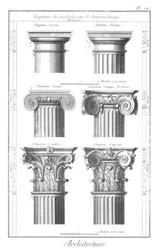
| Ancient greek pillars. Popular elements in baroque style too. |
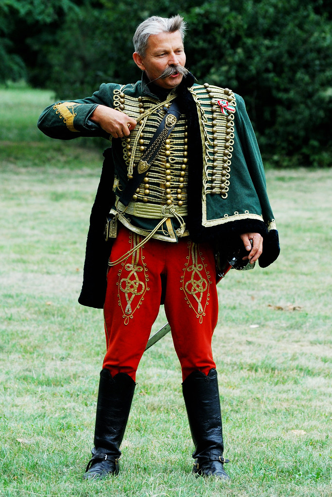
Now that we have all the bad guys, it's time for the good guy. Gróf Széchényi is a very rich hungarian noble person, who actually is living a double life. He is also the Hídember (Bridge-man), a hero in disguise, who keeps fighting against Austrian oppression years after the lost liberty war. He does not have any super powers, he just has very advanced technology. In short his character is following the Batman-cliché. On the picture below you can see him as himself (drawn directly from a portrait), and as the super hero below. For the super hero I just needed to add some weapons, a mask, and a hussar (huszár -light cavalry) uniform.
 |
| Gróf Széchény above, and the Hídember below |
 |
| Hussar uniform |
And finally, a bonus character: Dr Zwack. Every villain needs to have an evil genius, who provides wicked inventions. In reality Dr. Zwack József was the physicist of the Habsburg Court, who later funded the first hungarian liquor company. His most popular product was Unicum (and still is), a sort of herb liquor, which is good for the stomach. He did not look like this at all as I portrayed him on the picture below:
The design is based on a commercial of Unicum created in around 1905 (below). This inspired me to draw the evil genius Dr Zwack, as a kind of continuation from the original commercial: he is actually not in a lake or swimming pool, he is in his Life Support Tank filled with one of his special herbal potions which is keeping him alive.
 |
| The original commercial. |
He was not intended to be on the cover at all, but there is always room for old Marvel-like extra panels, like for example
"Guest starring: The Incredible Hulk". Since in this little panel only the head would fit, designing the whole body was not important at all, I just made it for fun.
Planning the scene and composition
Deciding what the scene and the composition should be, was much more difficult than I expected it to be...
One thing was clear: the hero has to be in a life-threatening situation, overpowered by the forces of the Kaiser with his gigantic steam-powered mech and a few (at least two visible) robolabanc.
I made a few sketches. First my idea was that the hero is standing face toward us with his sword in his hand, being surprised from the new big danger coming from the left. The texting in this version (translated from the picture):
Kaiser: "Haha, Bridge-man! My new super-robot is going to clean up the Empire from pests like you!"
Bridge-man: "Not today!"
The thing that was bothering me with this composition was, that the hero is taking a lot of space, not letting the actual highlight, the gigantic mech to get enough focus.
But then the main mantra of the Marvel Way book -"More drama!"- started to push me in a slightly different way. The hero should be on the ground, reaching towards his dropped sword. He is in the grip of the enemy coming from behind. The Kaiser feels so sure about victory that he even calls back his soldiers. He wants to finish our hero personally! This is it! A lot of drama, a lot of suspension. It makes you to want to know what is going to happen next! Then I wrote a new texting for this:
Kaiser: "Stand back Robo-soldiers! I the EMPEROR shall take care of the BRIDGE-MAN, so he won't be in the way of the Empire anymore!"
 |
| The upper 2 pictures and 1 below are the old concept: the hero is standing in the foreground. First closer, later more full-bodied. On the last picture you can see the basic idea for the final concept. |
 |
| Final concept. The circle on the right is the panel for the evil genius Dr Zwack. |
 |
| First sketch for the "Hídember" logo. Having two lions on two sides, just like on the Széchényi Lánc-híd (Chain Bridge). |
After I got the basic idea, it was time to dive into details. How should the mech stand? How do the robot soldiers hold their guns? I had to search for examples on the internet, because it was not easy for me to draw someone with a rifle in his hands...
 |
| Practicing a perfect pose for the Kaiser's mech |
 |
| On the top left, a possible background idea (copied from a picture found on Google). And poses for a robolobanc in attacking pose (also below) |
 |
| Practising the whole setup again, plus a more realistic lion sketch for the logo |
Pencilling
In the previous posts I explained how I made the character design and composition. Now it's time to for pencilling. This doesn't require too much explanation, it just had to be done...
 |
| The sketch for the cover using cubes, spheres and cylinders. |
 |
| And the pencilling. Ready to be inked! Note that at this point I thought that I don't need any background. What a fool I was! I added it later after inking... But that's a story for another post! |
Although this post got simple, let that not fool you! This required a few days for me to create. It was going much slower than I expected... There is a big difference between copying pictures and creating one yourself... Later on I will focus on making more own creations, to practice to work without guidance. I might even use the convenience that there are some characters I already designed (whole Hidember comic page, or a whole episode maybe?). Of course I was having the idea of making pictures or comic strips with other already existing characters (e.g. Asterix).
Inking
Before doing the inking, I was not sure if I should do it by hand or with the computer. After giving it some thought I chose to do it digitally. I am not such an experienced inker to do something like this.
I think it was a good idea to not be that brave for now.
Even digitally inking this picture took a lot of time. I think I spent at least a whole week with it, after work of course. Beneath, you can see the phases of inking:
 |
| Scanned it, then I started inking with digital pen |
 |
| All done! Or is it? |
 |
| I decided to go for shadows too. A lot of detail is lost from the robot's inking, but in return it pops out much better! |
At this point I was amazed how much work is needed to make such a thing. But luckily the only thing left is colouring. That's not a big thing with the computer right? (Wrong!)
Colouring and background
After the inking was done, it was time to do the colouring. I thought I'm going to spend much less time on it...
I started doing it with the filler tool in Sketchbook. It was going really nice and fast but then this happened:
Whoah! There is a lot of emptiness there... I was trying to fill it in with all kind of colours, but it just didn't seem enough. I had to accept that I am not going to get away with no background.
To make it happen first I was googling some pictures of 19th century Budapest. I chose the picture below:
Also the perspective is perfect! All I have to do is put it behind my picture and do the inking over it. That was clear that this won't be enough. There needs to be chaos. But making the houses like they were damaged is over my budget. So I just made the sky orange like there was fire:
This is almost it! It just needs to be more clear that the city is on fire and it's not a peaceful sunset in the background. So to make it very clear it is enough to utilise the good old "where there is smoke, there is fire" rule:
And voila! Thus we've got the picture from the first post of this series. But do note that there was a LOT of fiddling with the colours, especially for the sky, the smoke and the colour of the clothes of Hidember himself. The rest didn't change that much.
Amazing how much hours I spent on this one picture. Although it's far from perfect, I am amazed that I could make such a composition, placing 5 figures on the same scene without breaking the picture. I learned a lot while doing this. Looking forward to making a comic page with these characters!


Comments
Post a Comment